

2026’s Most Popular Paint and Blind Colour Combinations for Conservatories
Choosing the right colour palette can completely transform how your conservatory looks and feels. In 2026, the focus is on creating calm, cohesive spaces that feel connected to the rest of the home.
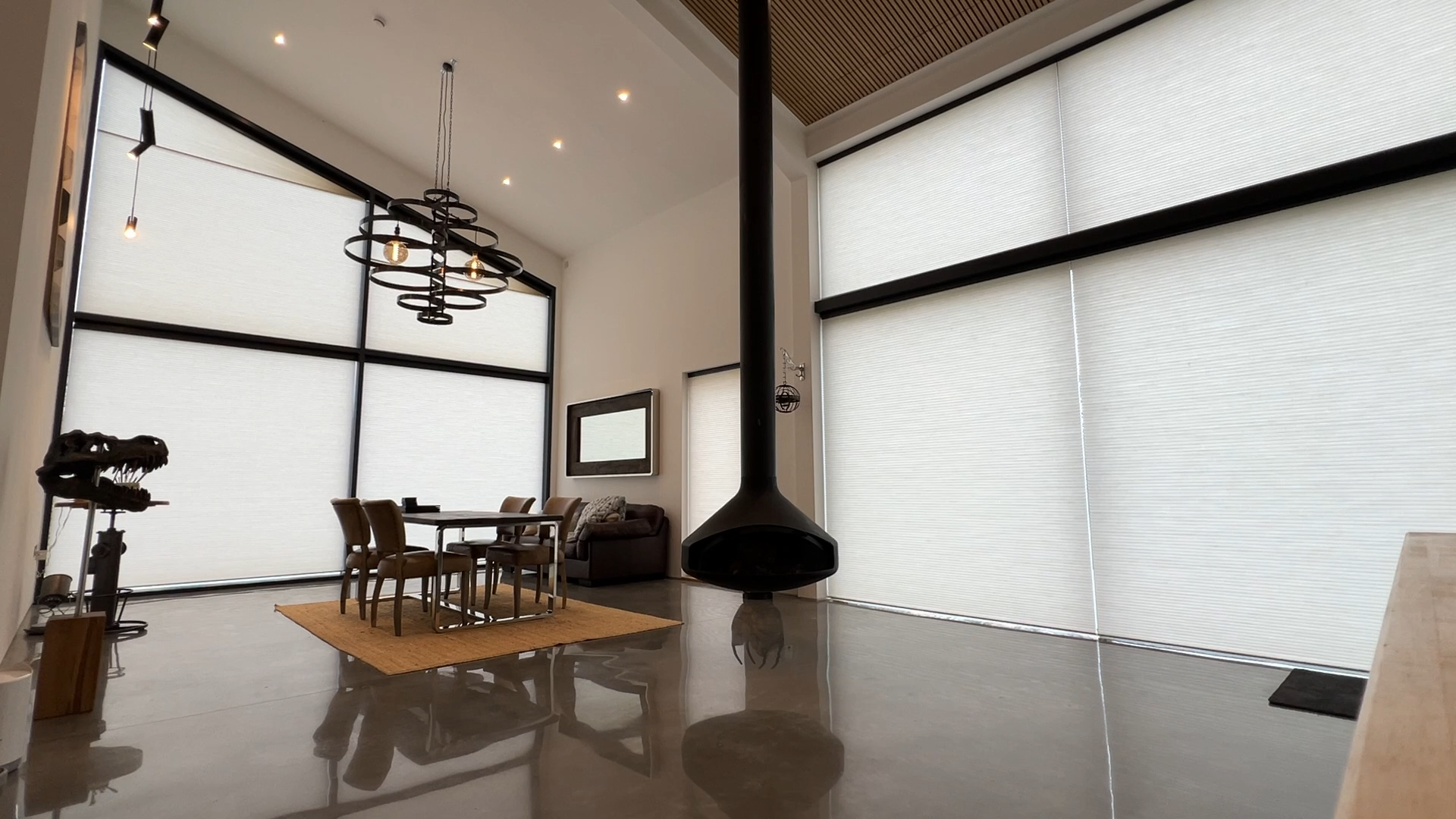
Pairing wall colours with the right blinds is key to achieving this. When done well, it can soften light, enhance mood and bring a sense of balance to the space.
What are the key conservatory colour schemes for 2026?
Current conservatory colour schemes are moving towards softer, more natural tones.
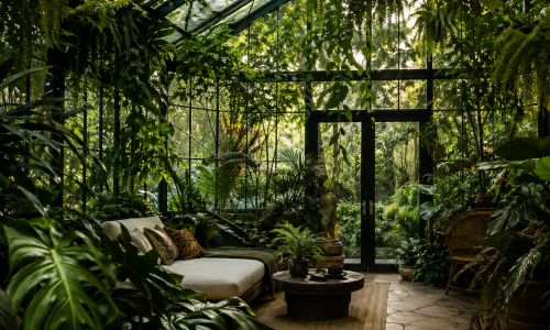
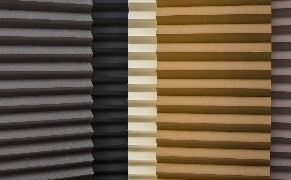
Warm neutrals, muted greens and earthy shades are becoming increasingly popular, reflecting a broader shift towards calm, grounded interiors. These palettes work particularly well in glass spaces, where natural light plays a major role in how colours are perceived.
Blinds should complement these tones rather than compete with them, helping to create a cohesive finish.

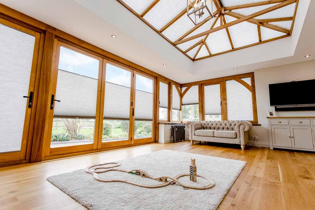
How do you match blinds to wall colours?
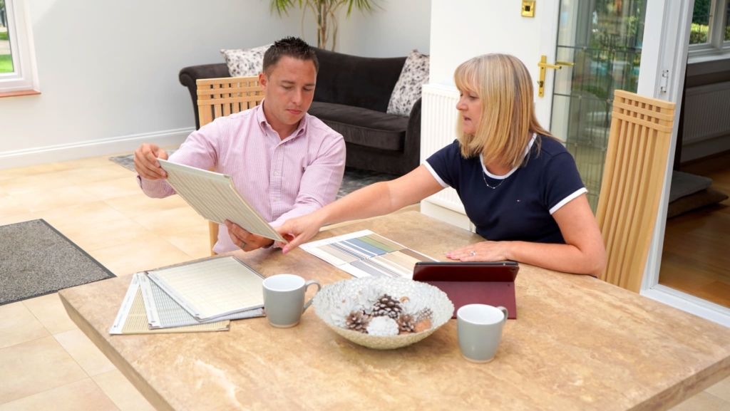
Matching blinds to wall colours is about balance rather than exact coordination.
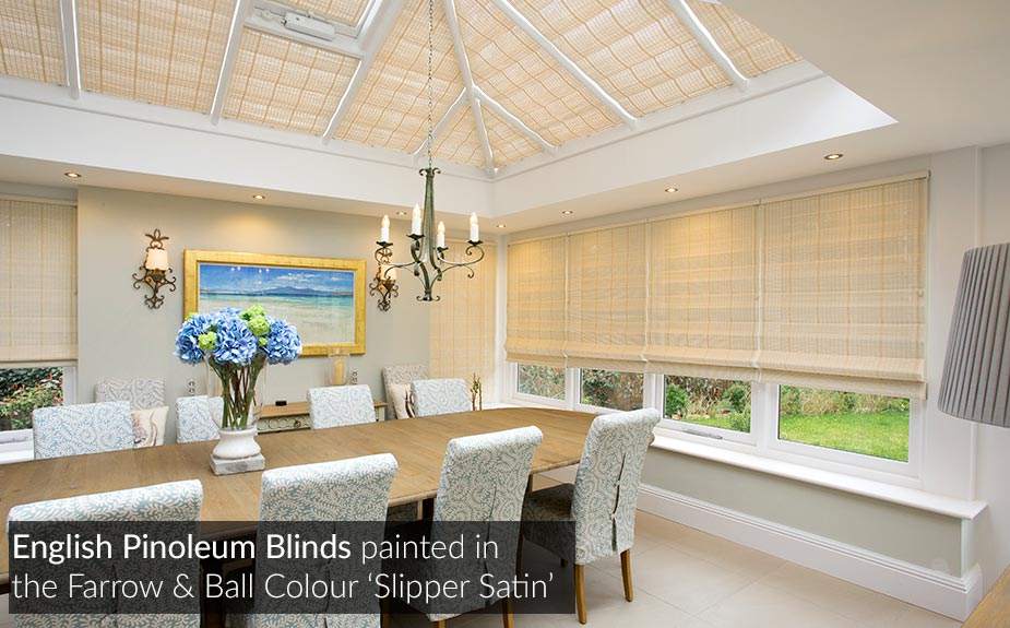
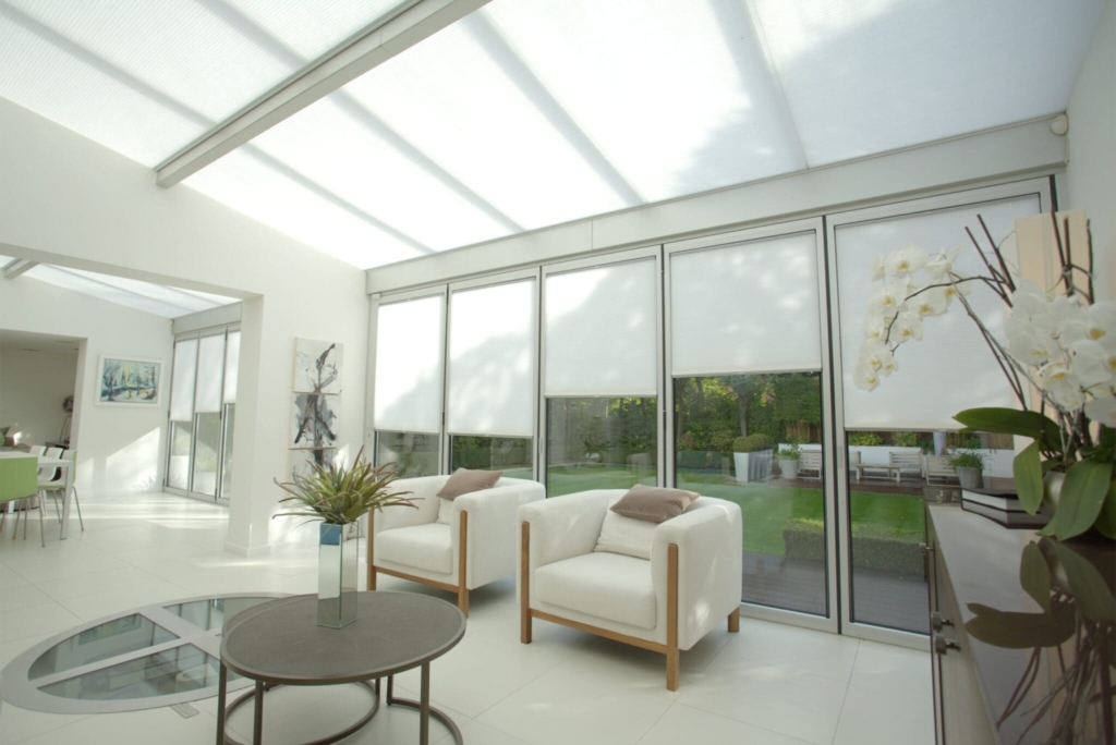
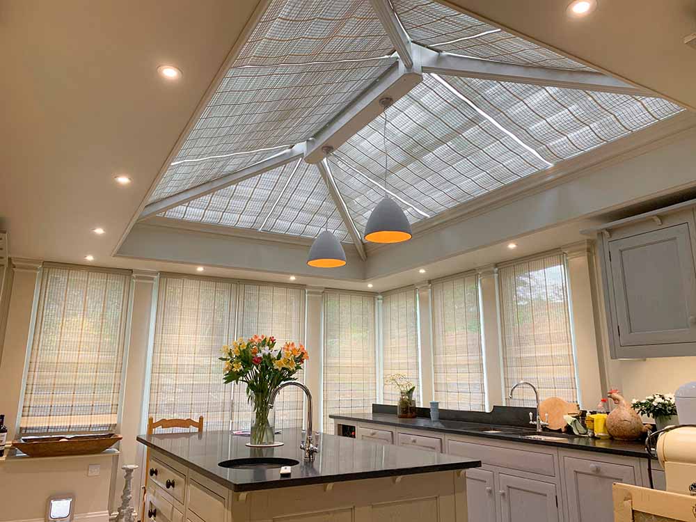
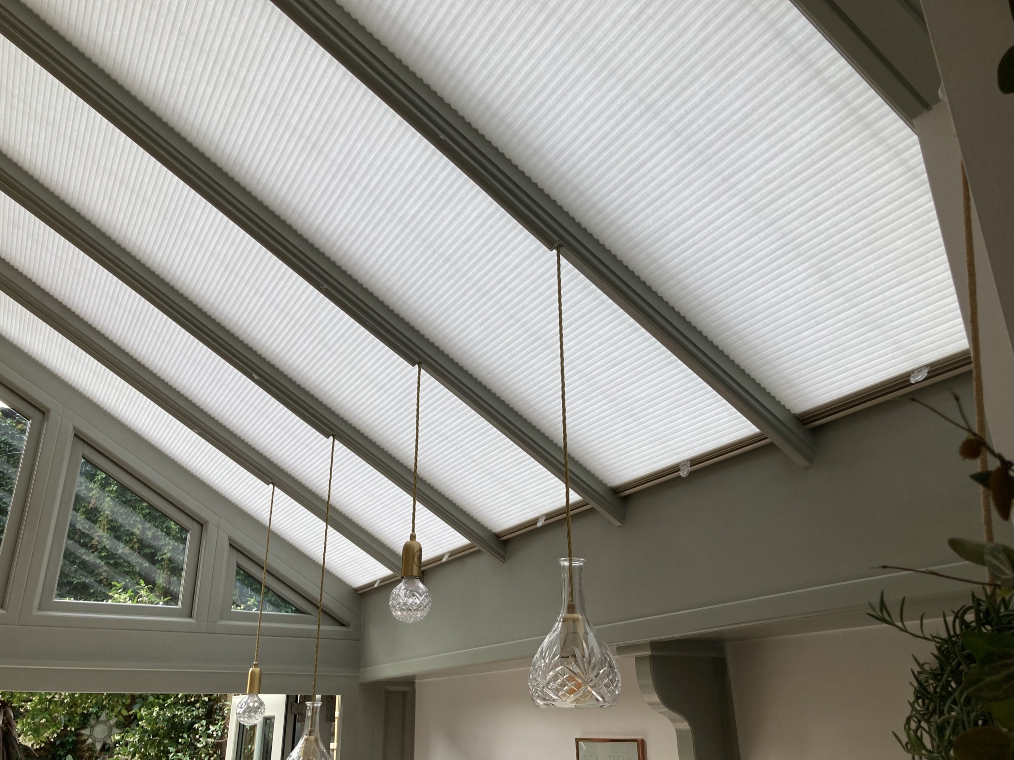
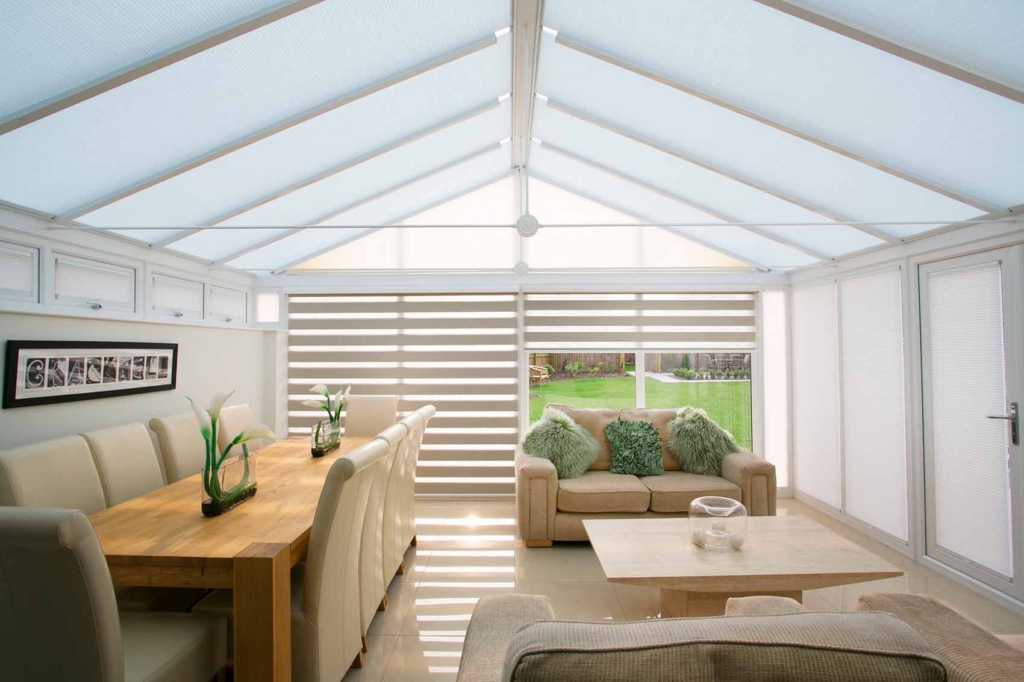
For a subtle, layered look, choose blinds in a similar tone to your walls. This works well in modern conservatory interior design, where a clean, understated aesthetic is often preferred.
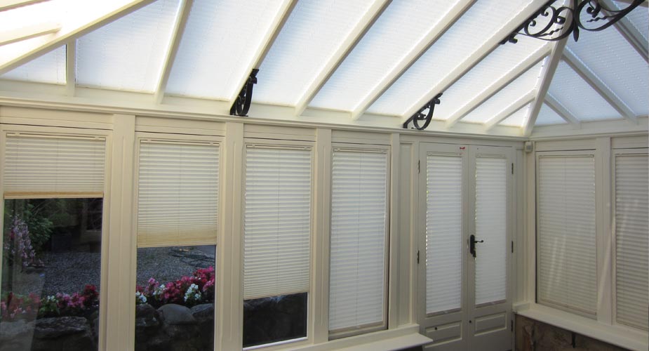
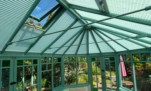
Alternatively, slightly contrasting shades can add depth without overwhelming the space. When exploring conservatory blinds ideas, it is important to consider how light will affect both the wall colour and the fabric throughout the day.

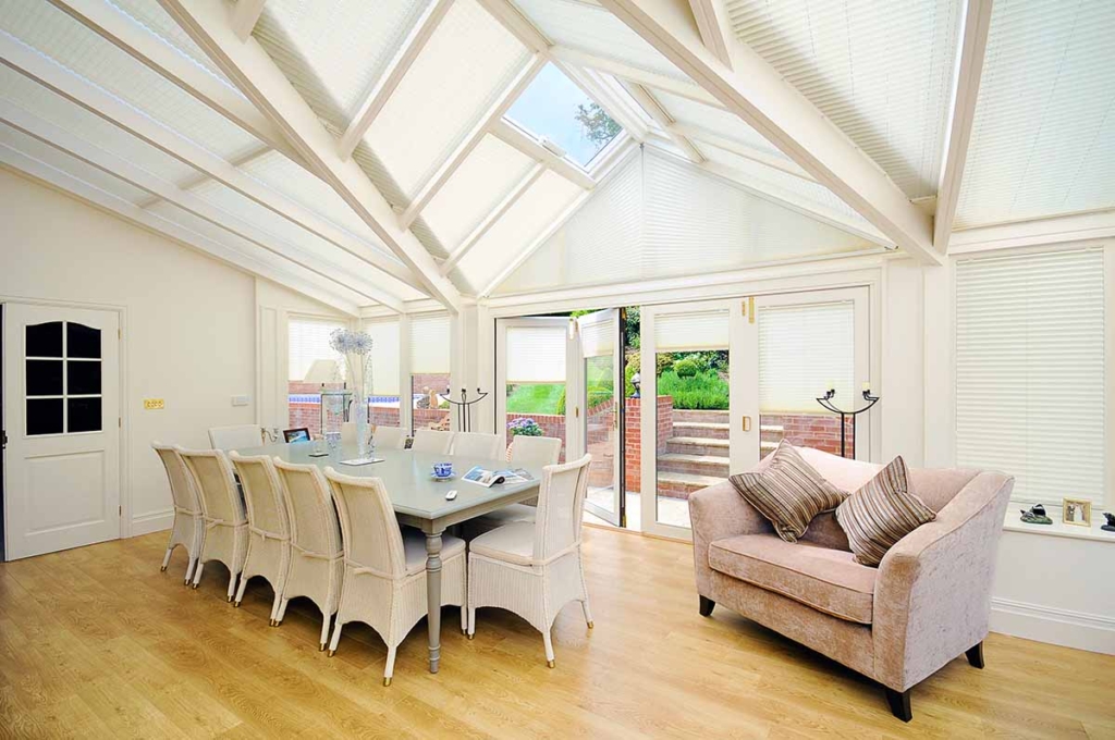
What colour combinations work best in a conservatory?
Some of the most effective combinations for 2026 include soft greens paired with neutral blinds, warm beige tones with light filtering fabrics and deeper earthy colours balanced with lighter shades.
These combinations help maintain a bright, open feel while reducing harsh glare. They also work well across a range of interior design ideas for conservatory spaces, from relaxed living areas to more structured dining or work zones.
Additionally, when choosing colours in a conservatory you should consider what colours you plan to use in your garden, as conservatories are all about bringing the outside, in.
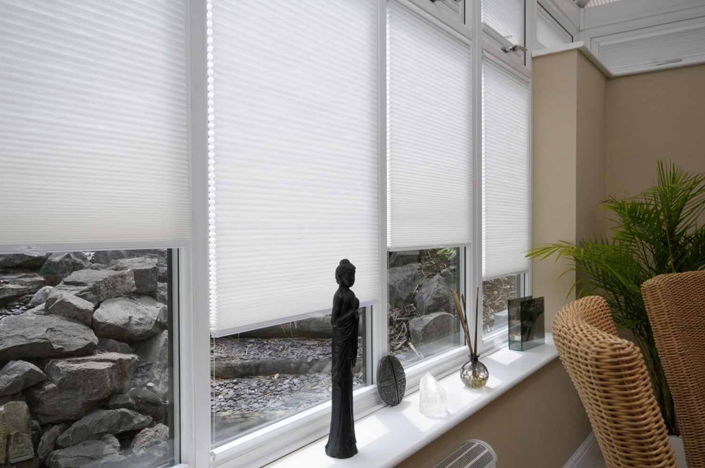
How can colour choices improve a small conservatory?
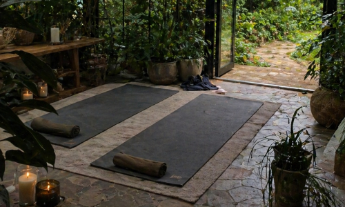
In smaller spaces, colour plays an even more important role.
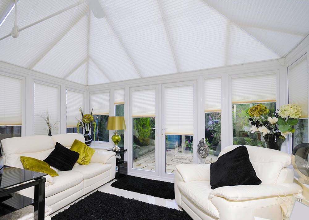
Small conservatory interior design ideas often focus on keeping the palette light and cohesive to avoid making the space feel enclosed. Blinds in soft, neutral tones can help reflect light and make the room feel more open.
This approach creates a sense of continuity, which is key in conservatory interior design inspiration that aims to maximise space.

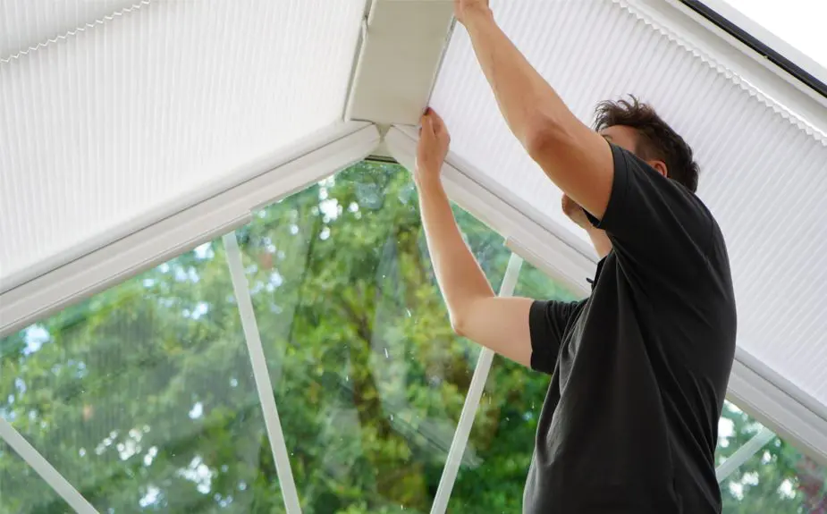
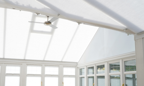
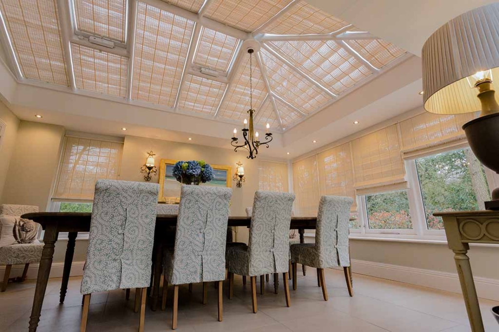
How do blinds enhance the overall design?
Blinds are not just functional. They are part of the overall colour story.
By carefully selecting fabrics that complement your chosen palette, you can create a space that feels considered and complete. This is particularly important in design ideas for conservatory interiors where light, texture and tone all work together.
Whether you are updating an existing space or starting from scratch, colour coordination between walls and blinds can make a noticeable difference.
HELPFUL INFORMATION
Frequently Asked Questions
What are the most popular conservatory colour schemes for 2026?
Soft neutrals, muted greens and earthy tones are among the most popular choices.
For further tips and advice, take a look at our Complete Buyer’s Guide for Conservatory Blinds.
Should blinds match wall colour in a conservatory?
They should complement rather than match exactly, helping create a balanced and cohesive look.
What colours make a conservatory feel bigger?
Light, neutral tones combined with soft, light-filtering blinds can help make the space feel more open.
How do blinds affect colour in a conservatory?
Blinds influence how light enters the space, which can change how colours appear throughout the day.